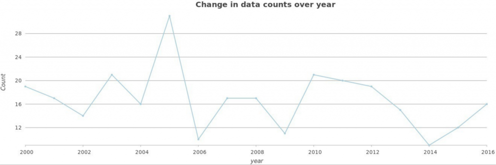
For this assignment, I decided to look at hurricanes since the year 2000. I wanted to see what years were most severe in terms of number of hurricanes since the start of the 21st century. Using the hurricane tract data, I created a line graph that depicted the number of hurricanes per year between 2000-2016. This graph revealed that 2005 and 2010 had the most hurricanes, and 2006 and 2014 had the fewest hurricanes. Based on this information, I mapped hurricane tracts and wind speed for each of these years (2005, 2006, 2010 and 2014) .
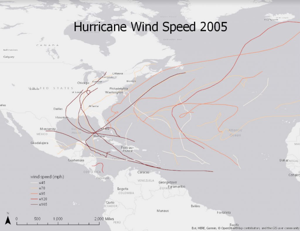
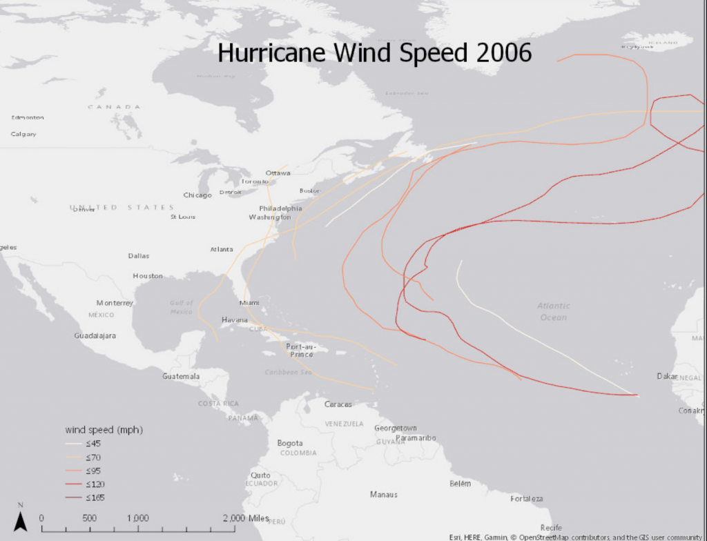
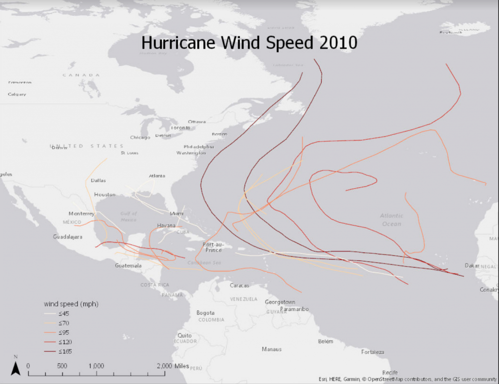
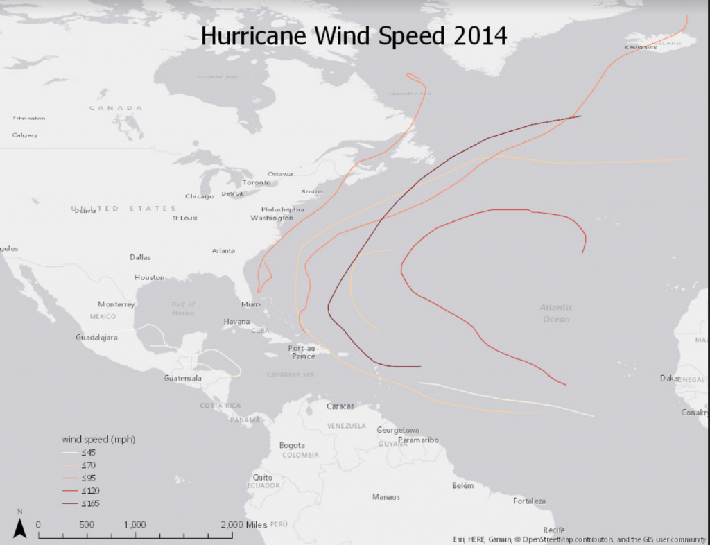
The maps I made for the years 2005, 2006, 2010 and 2014 indicate that the more hurricanes there are, the greater the disorder both visually and in reality. Based on these maps, it appears that during the years when there were the most hurricanes overall (2005 and 2010), many of these hurricanes had a high wind speed of 165mph or more. During 2006 and 2014 when there were the fewest hurricanes, there were also fewer hurricanes with high wind speed. In addition, based on these maps it appears that the more hurricanes there are in a year, the more the hurricane tracks intersect. During years when there were fewer hurricanes, hurricane tracts almost appear to line up or run parallel to one another. In contrast, the more hurricanes there are in a year, the more erratic the hurricane tracts appear and the more the hurricane tracks cross and intersect on the map. From a visual standpoint, these maps indicate that more hurricanes equate greater disorder. And I would expect the reality of this one the ground to be one in the same.