Blog #10

My project changed considerably over the past week or so. While I was originally playing around with trying to map individual gas lamps, this proved to be infeasible for the vast majority of streets in Manhattan. Consequently, I digitalized streets that has gas lamps instead.

These maps show streets where gas lamps were introduced between the years 1825 and 1840. The first map shows streets where gas lamps were installed between 1825-1830, the second shows streets with gas lamps between 1831 and 1835, and the last shows streets with gas lamps between 1836 and 1840. There is a clear upward progression to the streets where gas lamps were installed over time; between 1836-1840, gas lamps are installed in streets much farther north than between 1831 – 1835 and 1825-1830. As I begin to work on my paper, I will be exploring the reasons behind this trend. Additionally, I will be looking at the reasons why certain streets received gas lamps over others and will hopefully be able to explain how the geography of artificial light in Manhattan came to be.

Blog Post #9

This week I started working with base maps for my final project. I ended up choosing Perris’ “Maps of the City of New York” (1852-54). I chose this maps because it was the most comprehensive map that I could find that worked with the time period of my project. The only limitation of this map is that is only goes up to 42 Street, but I don’t think this will be a problem. I started my project by downloading the georeferenced maps from NYPL. Then I began to work out the best way to go about mapping gas lamps. Using Common Council reports, and reports from the Board of Assistants and the Board of Aldermen, I have gathered data that provides information on where gas mains and lamps were installed in Lower Manhattan. From the reports I have learned that by February 1836, there were a total of 6232 public lamps extending over 107 miles in Manhattan. Of these 6232 public lamps, 668 of these were lit with gas. These reports provide street names where gas lamps were installed, and occasionally provide information on the number of lamps installed on those streets. The reports also state that gas lamps were generally installed every 80-100ft. Over the past week, I have mostly been troubleshooting and trying to come up with the best system to map lamps. I started with Broadway, as gas lamps were first installed along Broadway from Battery to Grand street in 1825. From the reports, I knew that there were 120 gas lamps along this stretch of Broadway. In the first map I created, I placed gas lamps (each marked by a point) on each corner along both sides of Broadway from Battery to Grand Street. This came out to a total of of 96 points. I then added gas lamps to the middle of the blocks that were particularly long. By doing this, I was able to reach a total of 120 points. The map I created seems to be the most feasible in terms of where lamps were likely placed along Broadway, but I want to experiment a bit more and try mapping these lamps in a different way. I tried to use the split feature to divide a line, which ran on Broadway from Battery to Grant, in 100 ft increments. However, I was having trouble getting this to work. I feel confident though that I can map gas lamps on other streets besides Broadway by primarily placing lamps on street corners, as intersections are the most common location to find lamps.

Blog #8

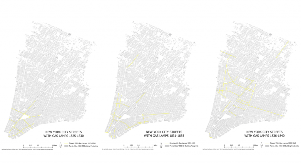
The reading I was assigned this week comes from Professor Baics book Feeding Gotham. I was specifically assigned to read Chapter 5 from this book, titled “Withdraw the Bungling Hand of Government.”  This chapter looks at the geography of food access in Manhattan under the new free market regime. In this chapter, Professor Baics shows how the public market system became increasingly fragmented by 1830s, through robust, comprehensive and tightly organized only a few decades earlier. Maps were used to analyze the distribution of food vendors in Manhattan following the decline of the public market system during the mid-nineteenth century.  

Sources: The principle data source was building-footprint level land-use designations from the Paris Fire insurance Atlas of 1852-54. By using land-use data, Professor Baics was able to reconstruct the spatial organization of Manhattan’s built environment during the mid-nineteenth century. By mapping land-use patterns in mid-nineteenth century New York, Professor Baics was to provide a snapshot of New York’s economic geography and urban development, and then situate food access within the Manhattan landscape while paying particular attention to both residential and commercial patterns.

Findings: Mapping land use showed that residential structures dominate the built environment. While there was widespread dispersal of industrial facilities across the entire built-up area, mixing in with residential and to a lesser extent, commercial uses, certain industries, such as ironworks and gasworks, settled along the shore, where they could benefit from direct access to the water. Lower Manhattan, below City Hall, was a highly commercial center and almost completely void of a residential population by the mid-nineteenth century. Lacking residents who depended on daily supplies, independent food shops mostly stayed away from the downtown area, unless they participated in the wholesale provision trade centered at Washington and Fulton markets.

As Manhattan moved away from the original configuration of centralized public markets, the geography of food distribution transformed into a complex and highly differentiated system. Within the newly unregulated system, the geography of food distribution followed some important and distinct patterns:

1) The dispersal of provision shops was determined both by urban growth and changing patterns of land use. By 1855, the core of Manhattan’s population was moving out of reach of public markets. Consequently, there were too many markets in the south and not enough in the north although people are moving from south to northern Manhattan. In addition, the hierarchy of streets, from mixed use to residential thoroughfares guided the locational choice of food vendors.

2) The old public market system survived, even through expansion halted and facilities were left to decay. Some old public markets became part of wholesale trade, while neighbored retail markets continued to supply local customers. In the Southern part of the city, the new food geography was incorporated into the existing one, with the two models completing and complementing each other. North of 14th street, food access was entirely subjected to the reign of free markets.

3) Different areas acquired unique geographies of provisioning. Wealthy uptown areas excluded provision stores and other undesirable businesses from their immediate vicinity, while more centrally located working class areas had numerous groceries, meat shops and other food vendors. The wealthiest areas did not rely on the convenience of provision stores, as it is likely that these households could rely on domestic help or home delivery. With the exception of elite uptown enclaves, New Yorkers could hardly reside at an address without having access to at least one grocery within a distance of three hundred feet; in practical terms, a little more than a one minute walk.

In sum, as independent food shops proliferated, the daily routine of food shopping was reconfigured to become a narrowly defined neighborhood experience where one did not need to travel beyond ones block. Under a free-market regime, food stores moved closer to their customers. Consequently, customers enjoyed greater flexibility in procuring necessities. A more differentiated food economy allowed for greater specialization, in terms of both goods and services. However, private food shops could not compare to the variety and volume of foodstuff available under the public market system. In addition, as the food economy relocated from public to private spaces, it became increasingly unregulated and unmonitored.

Maps show that mid-century new york city had a well-defined commercial geography with a central business district, two prominent thoroughfares, a fair number of mixed-use retail corridors, and a vast number of residential streets. All businesses had to find their economically viable place within the urban landscape. The main pattern of food shops was to disperse and follow customers into the heart of neighborhoods, in effect, to withdraw from New York’s public markets and retail centers, except from the grid’s avenues. Consequently, the center of urban public life had moved away from the marketplaces to the streets.

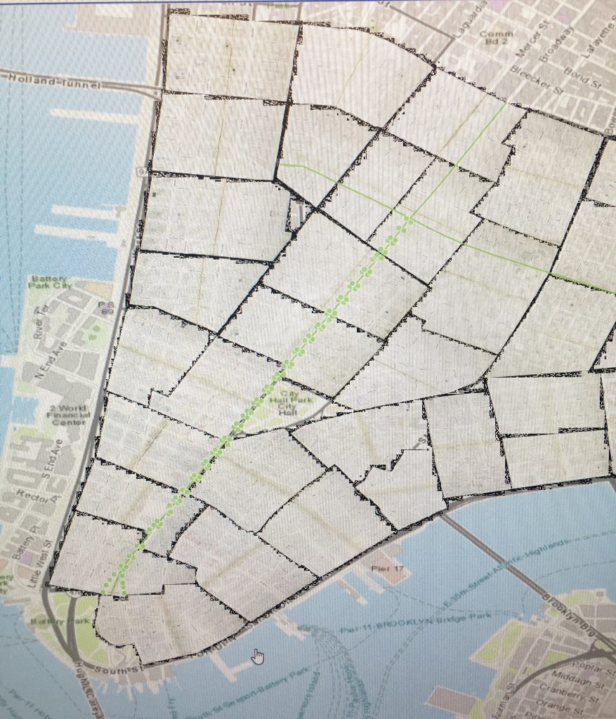
Project Update: I am continuing to work on building my dataset. I hope I will be in a place after the thanksgiving break where I can begin to start mapping. 

Blog #7

For my final project, I will be working on the mapping portion of my senior thesis. For my senior thesis I am mapping gas lamps in Manhattan during the early 19th century (approximately 1827-1850). The principal dataset I will be using for this project is one that I made myself. I am in the process of going through New York City records and compiling information about when and where gas lights were first installed in Manhattan. For my final project in this class specifically, I am planning on mapping early gas lights in Manhattan. Most likely, I will map gas lamps that were installed on city streets between the years 1827-1831. I am using documents called “Minutes of the Common council of the city of New York, 1784-1831” to reconstruct street lighting for this time period. I am focusing on a narrow timeframe for this project, because this is the data that I have compiled so far. After 1831, the city documents that I need are not all digitalized, and so I will likely not have the information in time for this project.

In addition to mapping gas lamps, I am planning to use a data set called “Land Use before the Civil War [1827-1849]” from Jason Barr’s “Building the Skyline.” One problem I’ve run into when looking for potential datasets is that my time period of focus is relatively early. Consequently, I have found more data available for the late 19th century than for the early to mid 19th century.

Blog #6

https://arcg.is/189WXm

For this blog post, I created a map that features major US cities that are in close proximity to interstate highways. In creating this map, I clipped the US interstate shapefile to the Major US cities shapefile. I set the parameters so that the US cities remaining on the map were within 20 miles of an interstate. As the interstate highway system is extensive in the US, there are numerous cities that fall within 20 miles of an interstate. The interstate highway system appears to be densest in the midwest and northeast, and there are many cities that fall within close proximity to highways in this area. Interstates are most dispersed in the middle of the country, and cities in this area are also less concentrated.

In addition to the US major cities shapefile and the US interstates shapefile, I also added a layer to this map from the Living Atlas called “2018 USA Population Density.” By looking at interstates in relation to population density in the US, it is noteworthy that the areas with the highest population density appear to be the areas where the greatest number of interstates intersect. Based on this map, it appears that the areas with the highest population density, the largest US cities, have the greatest demand and require the greatest flexibility in terms of transportation, and consequently these areas have the greatest number of interstate highways.

One main question arose when looking at this map: did the interstate connect these cities, or where there cities established because of the need for breaks in transportation along the interstate? If I were to work with this data more, this is what I would be interested in exploring.


Blog #5

For this assignment, I decided to look at hurricanes since the year 2000. I wanted to see what years were most severe in terms of number of hurricanes since the start of the 21st century. Using the hurricane tract data, I created a line graph that depicted the number of hurricanes per year between 2000-2016. This graph revealed that 2005 and 2010 had the most hurricanes, and 2006 and 2014 had the fewest hurricanes. Based on this information, I mapped hurricane tracts and wind speed for each of these years (2005, 2006, 2010 and 2014) .

The maps I made for the years 2005, 2006, 2010 and 2014 indicate that the more hurricanes there are, the greater the disorder both visually and in reality. Based on these maps, it appears that during the years when there were the most hurricanes overall (2005 and 2010), many of these hurricanes had a high wind speed of 165mph or more. During 2006 and 2014 when there were the fewest hurricanes, there were also fewer hurricanes with high wind speed. In addition, based on these maps it appears that the more hurricanes there are in a year, the more the hurricane tracks intersect. During years when there were fewer hurricanes, hurricane tracts almost appear to line up or run parallel to one another. In contrast, the more hurricanes there are in a year, the more erratic the hurricane tracts appear and the more the hurricane tracks cross and intersect on the map. From a visual standpoint, these maps indicate that more hurricanes equate greater disorder. And I would expect the reality of this one the ground to be one in the same.

Blog #4


For this assignment, I georeferenced sheet 00129 from the 1895 Sanborn Fire Insurance Map. This sheet depicts the portion of the West Village neighborhood in Manhattan bound by Little 12th Street, Greenwich Street, Bethune Street and West Street. The map appears to have georeferenced successfully, and with seemingly little error. There are a number of features on the historical map that are particularly notable. Prominent on the map is Gansevoort Market, which dominates the upper portion of the map. In addition, the historical map features what appears to be a fairly industrial area. There are numerous factories and mills labeled on the map, including a plaster mill, a paint factory and a furniture factory. After georeferencing this map, I noticed that in addition to the numerous factories, there were also a large number of stables labeled on the map. Consequently, I decided to digitalized all the buildings listed as stables. Tracing the stables revealed that there is a stable on almost every city block featured on this map. The high number of stables in this area is likely due to the heavy industrial presence; due to the quantity of production that occurs in this area, a consistent source of transportation would be necessary to move goods, and in 1895 horses would play a heavy role in the transportation of these goods. In addition, Gansevoort Market would also require the use of horses to move around goods. By digitizing stables, I also noticed that there are more stables located on the blocks closer to the Hudson River. This is perhaps because of the wharfs located along the river, and the need for horses to move goods to and from the piers.

When making this map I couldn’t remember how to remove the background white from the historical map. If I were to do this again, I would remove the background white or make the georeferenced map more transparent. 

Blog #3

The map we created in lab last Monday shows population density per acre in Manhattan and the surrounding boroughs for the year 1920. Based on this map, it appears that the areas with the highest population density are located within Manhattan. While there are areas that have more than 651 people per acre in Brooklyn and the Bronx, population density in Manhattan appears to be far more concentrated. The areas with the highest population density appear to be the Lower East Side and East Harlem. This map supports the historical argument that the most densely populated areas are the poorest areas. During the late 19th Century, the Lower East Side and East Harlem had large immigrant populations. Thus the high population density in these neighborhoods supports the notion of crowing within immigrant communities and the corresponding association of poverty.

I found it interesting that the areas in Manhattan with the highest population density were also the areas that developed first as the city grew over the course of the 19th century. In a way, the population density map reflects patterns of growth in Manhattan, suggesting that the areas that were settled first have the highest population density decades later. Lower Manhattan has a low population density in 1920, and this makes sense as the area was highly commercialized and business district. The Lower East Side appears heavily populated, as it was during the 19th century. The Upper East Side appears to have a higher population density than the Upper West Side, but this makes sense as the Upper East Side was developed first. East Harlem had a residential settlement fairly early on compared to the rest of Upper Manhattan, and by 1920 East Harlem appears to be one of the most populated parts of Manhattan. Based on this observation, this map suggests that early development in the 19th century predisposed areas to high population density by the early 20th century.  

Blog #2

Figure 1: Population of Australians by County 1910

For this project, I mapped population by country of Australians in the United States for the year 1910. This map (Figure 1) provides a visual depicting where Australians in the United States resided in 1910.  Based on this map, the greatest number of Australian born people were living in San Francisco, California and the surrounding areas (Figure 2). In San Francisco county there is a total of 1347 Australians. In the neighboring Alameda county there is a total of 594 Australians.

According to Figure 1, while the majority of Australians in the United States were located on the West Coast and predominantly in counties in California, there are two exceptions to this pattern. There is one country in Salt Lake, Utah that has a notable Australian population, and one country in Cochise County in Arizona that has a number of Australians. However the scale of Australians in these counties are very small; in Salt Lake there are 115 Australians while a total population of 131,426 people. Additionally, in Cochise county there are 21 Australians total, while the total population is 34,591 people. Based on this map there does not appear to be a single Australian east of Cochise County in Arizona.

Figure 2: Population of Australians by County- West Coast

The major take away from this map is that visuals can be deceiving; while it appears that there is a comparatively sizable number of Australians living on the West Coast than the Midwest or East Coast in 1910, in fact the numbers are very small. In 1910 there are a total of 416,912 people in San Francisco County and only 1,347 Australians. Similarly in Alameda County, there was a total of 246,131 people and only 594 Australians. The overall small number of Australians living in the United States is perhaps a reflection of the population of Australia as a whole. In 1911, Australia had population of less than 4.5 Million people total. As Australia’s overall population in 1910 is fairly small, then the overall population of Australians in the United States is also fairly small (“1911-2011 Census Data – a Record of Australia’s Growth and Development”).

There are two obvious question to investigate when looking at this map: What brought these native born Australians to the United States and why are Australians in the United States concentrated in California? Perhaps the relatively high concentration of Australians on the West Coast is because it is easier to get from Australia to the West Coast than the East Coast of the United States. Additionally, given that this map depicts population for the year 1910, the concentration of Australians on the West Coast could be explained by the California Gold Rush, which was a large draw for immigrant populations all over the world during that later part of the 19th Century. It is notable that Australia experienced a Gold Rush around the same time as the California Gold Rush. However, from 1895-1902 Australia experienced the worst drought since European settlement, which perhaps provided incentive for migration from Australia to the United State’s West Coast ( “Defining Moments in Australian History”). 

To add to this map and perhaps provide greater context behind the history of Australians living in the United States, it would be interesting to compare this map to a map of the population by country of Australians in the United States for the year 1852, when the California Gold Rush reached its peak. Comparing population maps over the years would perhaps provide insight in regard to the importance of the Gold Rush and environmental factors in determining the distribution of Australians in the United States. In addition to these population maps, I would be interested in mapping routes for the United States First Transcontinental Railroad. I would be interested in seeing how population distribution reflects accessibility, which could perhaps provide insight as to whether the distribution of Australians in the United States is based on geographic accessibility or other cultural and social factors.

Works Cited:

“Defining Moments in Australian History.” National Museum of Australia, National Museum of Australia, www.nma.gov.au/online_features/defining_moments.

“1911-2011 Census Data – a Record of Australia’s Growth and Development.” Statistical Language – Measures of Central Tendency, Australian Bureau of Statistics , www.abs.gov.au/websitedbs/censushome.nsf/home/CO-57?opendocument&navpos=620.

Hello world!

My name is Rachel Eu, and I am from San Francisco, California. I am a senior at Barnard College majoring in history with a concentration in Urban History. I am taking this course at the suggestion of my thesis advisor, Gergely Baics, as I am hoping to use GIS as a major component of my senior thesis. I have yet to settle definitively on a topic, but I would like to focus my thesis on late-19th century New York City. I am looking forward to learning more about HGIS and spatial history in this course!