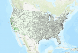
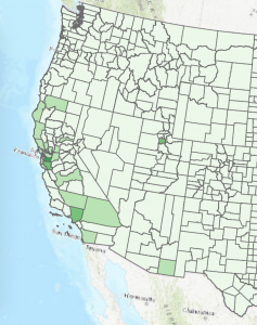
For this project, I mapped population by country of Australians in the United States for the year 1910. This map (Figure 1) provides a visual depicting where Australians in the United States resided in 1910. Based on this map, the greatest number of Australian born people were living in San Francisco, California and the surrounding areas (Figure 2). In San Francisco county there is a total of 1347 Australians. In the neighboring Alameda county there is a total of 594 Australians.
According to Figure 1, while the majority of Australians in the United States were located on the West Coast and predominantly in counties in California, there are two exceptions to this pattern. There is one country in Salt Lake, Utah that has a notable Australian population, and one country in Cochise County in Arizona that has a number of Australians. However the scale of Australians in these counties are very small; in Salt Lake there are 115 Australians while a total population of 131,426 people. Additionally, in Cochise county there are 21 Australians total, while the total population is 34,591 people. Based on this map there does not appear to be a single Australian east of Cochise County in Arizona.
The major take away from this map is that visuals can be deceiving; while it appears that there is a comparatively sizable number of Australians living on the West Coast than the Midwest or East Coast in 1910, in fact the numbers are very small. In 1910 there are a total of 416,912 people in San Francisco County and only 1,347 Australians. Similarly in Alameda County, there was a total of 246,131 people and only 594 Australians. The overall small number of Australians living in the United States is perhaps a reflection of the population of Australia as a whole. In 1911, Australia had population of less than 4.5 Million people total. As Australia’s overall population in 1910 is fairly small, then the overall population of Australians in the United States is also fairly small (“1911-2011 Census Data – a Record of Australia’s Growth and Development”).
There are two obvious question to investigate when looking at this map: What brought these native born Australians to the United States and why are Australians in the United States concentrated in California? Perhaps the relatively high concentration of Australians on the West Coast is because it is easier to get from Australia to the West Coast than the East Coast of the United States. Additionally, given that this map depicts population for the year 1910, the concentration of Australians on the West Coast could be explained by the California Gold Rush, which was a large draw for immigrant populations all over the world during that later part of the 19th Century. It is notable that Australia experienced a Gold Rush around the same time as the California Gold Rush. However, from 1895-1902 Australia experienced the worst drought since European settlement, which perhaps provided incentive for migration from Australia to the United State’s West Coast ( “Defining Moments in Australian History”).
To add to this map and perhaps provide greater context behind the history of Australians living in the United States, it would be interesting to compare this map to a map of the population by country of Australians in the United States for the year 1852, when the California Gold Rush reached its peak. Comparing population maps over the years would perhaps provide insight in regard to the importance of the Gold Rush and environmental factors in determining the distribution of Australians in the United States. In addition to these population maps, I would be interested in mapping routes for the United States First Transcontinental Railroad. I would be interested in seeing how population distribution reflects accessibility, which could perhaps provide insight as to whether the distribution of Australians in the United States is based on geographic accessibility or other cultural and social factors.
Works Cited:
“Defining Moments in Australian History.” National Museum of Australia, National Museum of Australia, www.nma.gov.au/online_features/defining_moments.
“1911-2011 Census Data – a Record of Australia’s Growth and Development.” Statistical Language – Measures of Central Tendency, Australian Bureau of Statistics , www.abs.gov.au/websitedbs/censushome.nsf/home/CO-57?opendocument&navpos=620.
Hey Rachel, I think this is a really cool map! Like you mentioned, I think it could be very interesting to look at this map in comparison to 1852, when the Gold Rush was at its peak, or with railroads to get a sense of the channels people might have been moving along. As for the somewhat misleading nature of the map, do you think it could be helpful to normalize for total population? I know that most of the country would probably have a very small percentage Australian-born population; Could it be possible that some of the areas around San Francisco are standing out only because they have a higher population in general?
Rachel, this is a really cool and specific map. I really like your focus and appreciated the detail. I am also interested to see how or if the Gold Rush played a role in Australians in California.