
Hi guys! Currently working on renovating my website (which you can check out here: jessicapeng.com), so I decided to share an extremely useful tool I am using for CSS and formatting things on the website: https://css-tricks.com/snippets/css/a-guide-to-flexbox/
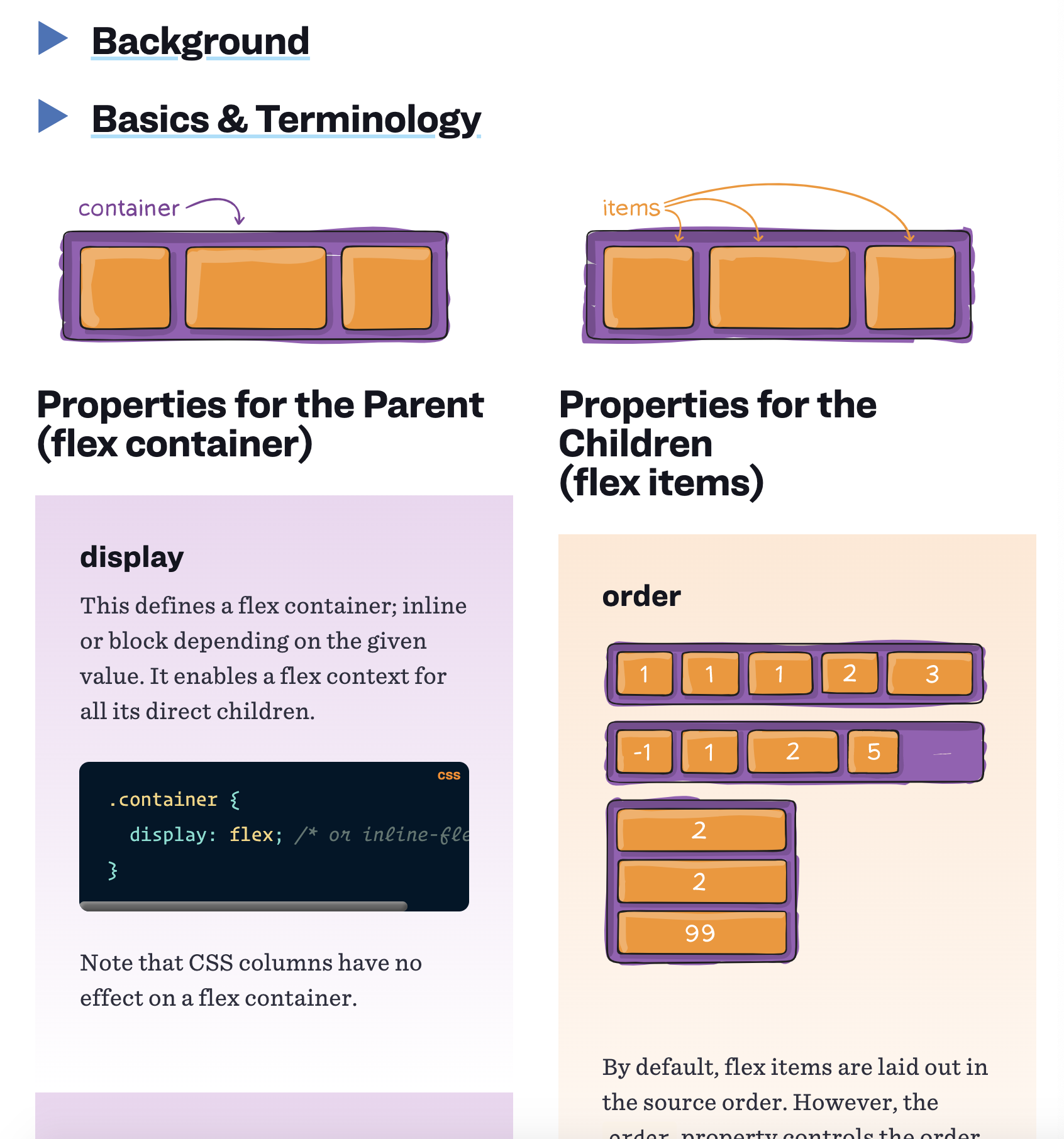
I especially like this website because it formats the properties you use for the parent of the flex container on the left and the properties for children (inside the parent containers) on the right so you don’t have to frantically scroll through lots of syntax and information to find the distinctions and syntax. It looks like this:
One of the really useful tools I found was the magic of warp! I didn’t know flex had the property where they could not only help you align everything in 1 row, but they actually allow images to warp one-by-one to the bottom if there’s not enough space. This is so incredibly convenient because I no longer to hard-code the responsiveness of each element and redesign at each px size of the website. Flex does this for me!
This was the css of outside container or div that contained the images I wanted to align:
.container
{
display: flex;
align-items: center;
justify-content: center;
}
This allowed all the images in my container to be aligned in a row, and centered all the elements inside the container (vertically and horizontally I believe).
Another really useful tool to learn flexbox froggy that has a 24 exercises to do with aligning frogs on lilypads that help you practice the syntax and functions of flex. Before I really start web development again, I might have to redo those exercises. Link to flexbox froggy: https://flexboxfroggy.com/
What it looks like:
