In late February, hundreds of lawyers, architects, planners, and marketers descended on the New York Bar Association for a “Discussion at the Intersection of Marketing, Design, Planning and Law.” It was a diverse group to be sure, and I found myself somewhat uncomfortably among them.
Panelists included Shake Shack’s CEO, a Columbia business professor, the creative director of architecture firm Gensler, a Washington University law professor, a Columbia-bred planner, and the eccentric principal of the Frederic Schwartz design firm. Moderated by a self-admittedly design-handicapped attorney, the dialogue was animated, if not entirely civil.
At the core of the meeting was the question: can buildings be branded? According to U.S. trademark law, the short answer is yes. Companies have been exploiting their built spaces, particularly retail spaces, as branding vehicles for as long as brands have existed. McDonalds’ iconic golden arch drive-thru and Disney’s fabled Main Street USA have cemented those brands into our collective consciousness.
Branded spaces are consistent, distinct, and compelling. They ensure that we know exactly where we are, and they are a valuable component of the comprehensive, multisensory experience of consuming. But a building is infinitely more complex than a logo and things can get messy when one architect’s peerless vision is public domain for another.
Just such a disagreement erupted in the discussion when Mr. Schwartz’s vertical bamboo motif for clothing retailer Aéropostale was deemed not distinct enough to be protected by trademark law. But Gensler’s John Bricker said he just laughed when he discovered that a candy store in Dubai had shamelessly ripped off several elements of his design for Dylan’s Candy Bar, the famous New York shop. Imitation, after all, is the highest form of flattery.
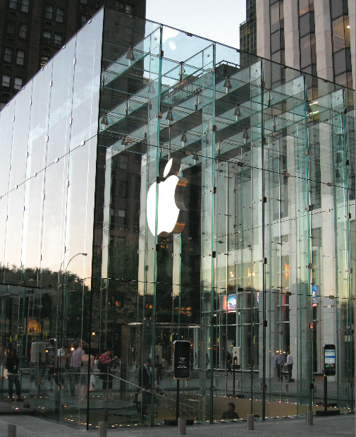
Corporate marketers and trademark lawyers everywhere are watching closely to see if the U.S. Patent and Trademark Office grants Apple its application to trademark the famously minimalist aesthetic of its stores. The approval would come as a surprise to many; despite being the reigning tastemaker of American product design, Apple’s store design is rather generic. While Apple, like many retailers, tends to keep its store design consistent in each location, who is to say that the ubiquitous steel and wood classroom-like interior is truly unique to Apple?
But buildings as brands run counter to one of architecture’s fundamental tenets: that a building be a product of its environment. How can a building respect its context if corporate policy mandates that it look like every other store’s layout and design? In the same vein, brand consistency writ large translates into dull repetitiveness in the urban environment. Today’s city dwellers are unlikely to blink at the sight of another Starbucks or McDonalds. New Yorkers like to complain that the city’s unique abundance of locally-owned shops is giving way to a slew of the national chain stores more common in the suburbs.
Questions of real estate and price competition aside, national chain stores do make city streets less exciting spaces to inhabit. But branded environments are not the exclusive realm of global corporations. Pressure to compete with the big guys and increasing access to creative resources and technologies have allowed many small business owners to craft clever identities for their spaces.
Neither are global corporations necessarily averse to experimenting with and diversifying their architectural languages. Some long-established brands are beginning to recognize the value in differentiation. New York City, ever the epicenter of consumption, is the new home of Nike’s SoHo “atelier” and Toys R Us’ marquee-wrapped Times Square flagship. These not-so-subtle appropriations of place may further commercialize the city, but they might also add to its distinctly capitalist character. With the U.S. Patent Office acting as judge, at least we know the fate of the city is in good hands.
By Alexander McQuilkin
 “Never let a good crisis go to waste.” Chicago’s new mayor Rahm Emanuel’s words seem to have captured the spirit of the times, especially among planning and policy wonks. With the foreclosure crisis reeking havoc on communities across the country, not to mention the national economy, policies promoting homeownership are beginning to be questioned.